The Greece Lean Six Sigma Logo: Symbol, Colours and Lean Philosophy
Our logo is not decoration. It is the visual signature of how we have worked for 14 years in Greece, Cyprus and Europe: purposeful direction, structure that allows movement, and value that flows.
- Direction
- Structure
- Flow
- Balance
The logo at a glance
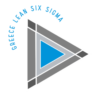
Anatomy of the logo
Every element of the logo maps to a Lean Six Sigma principle.
Direction: the right-pointing triangle
A universal symbol of intent and progress. It shows purposeful movement that is guided rather than rushed, like a DMAIC project that knows where it is going.
Structure: triangles as the base
The triangle is the most stable geometric shape. It stands for focus, structural strength and standard work, the foundation of every improvement.
Balance: the trapezoids
Proportion and adaptability. Systems that evolve without losing coherence, like a PDCA cycle that repeats without breaking stability.
Flow: the overall movement
The composition reads from left to right, like value flowing from supplier to customer. No dams, no bottlenecks.
From symbol to practice
| Element | Lean Six Sigma principle | What it means for your organisation |
|---|---|---|
| Right-pointing triangle | Purpose and direction (Hoshin) | Improvement projects with a clear goal and measurable KPIs |
| Triangles as the base | Standard work | Stable processes before any improvement |
| Trapezoids | Continuous improvement (Kaizen, PDCA) | Change without disruption to daily operations |
| Left-to-right movement | Value flow and pull | Less waiting, less inventory, faster service |
| Blue | Trust and transparency | Transparent training, assessment and certification |
| Grey tones | Data-driven decisions | Objective assessment and evidence-based decisions |
Flow, change and continuous improvement
Heraclitus: Panta Rhei
Everything flows. Change is constant and natural. Excellence comes not from resisting change but from understanding and governing it well.
Taiichi Ohno: value flows
The architect of the Toyota Production System described the ideal system as a calm river, with no dams, bottlenecks or artificial acceleration. Lean Six Sigma removes whatever blocks that flow.
Komorebi: light through the leaves
The Japanese image behind our philosophy: balance, gentle strength and systems that let people perform at their best.
Progress needs structure, and structure must allow movement.
Brand colours
The colours were chosen for meaning and readability, not fashion.
Blue #0094DA
Inspired by the sea and the Greek landscape. Trust, reliability and calm authority.
White #FFFFFF
Simplicity and clarity. Straightforward solutions and accessible learning design.
Grey #797A7B
Balance, neutrality and judgement for objective assessment.
Light grey #C6C8C9
Softness and space to think.
Dark grey #595959
Maturity, professionalism and seriousness of purpose.
Using the logo correctly
Allowed
Using the official file, in white or blue, with enough clear space around it, on material about a partnership or training with GLSS.
Not allowed
Distorting it, changing its colours, adding shadows or effects, placing it on a background that hurts legibility, or any use that implies the certification of an organisation.
Certification marks
Certified graduates use the mark of their certification only while it is valid, in line with our policy.
Logo Use Policy →Need the logo files for a partnership, event or publication? Email info@greeceleansixsigma.gr and we will send the official files with usage guidance.
A visual expression of our practice
Our logo and visual identity represent an approach to Lean Six Sigma that is:
This is how we design learning. This is how we govern improvement. This is how value flows.
Frequently asked questions
What does the Greece Lean Six Sigma logo stand for?
The right-pointing triangle stands for direction and progress without haste. Triangles and trapezoids express structure that allows movement, and the composition reads as value flowing from left to right.
What are the brand colours?
Blue #0094DA, white #FFFFFF, grey #797A7B, light grey #C6C8C9 and dark grey #595959.
Why blue?
Blue is inspired by the sea and the Greek landscape and expresses trust, reliability and calm authority.
Can I use the GLSS logo?
Only with our permission and in line with our Logo and Certification Mark Use Policy. For the official files, email info@greeceleansixsigma.gr.
Does using the logo mean certification?
No. The GLSS logo does not certify organisations. Certified graduates only use the mark of their personal certification while it is valid.
Let us talk about your organisation's challenge
Operational Excellence, Lean Six Sigma and team training in Greece, Cyprus and Europe.